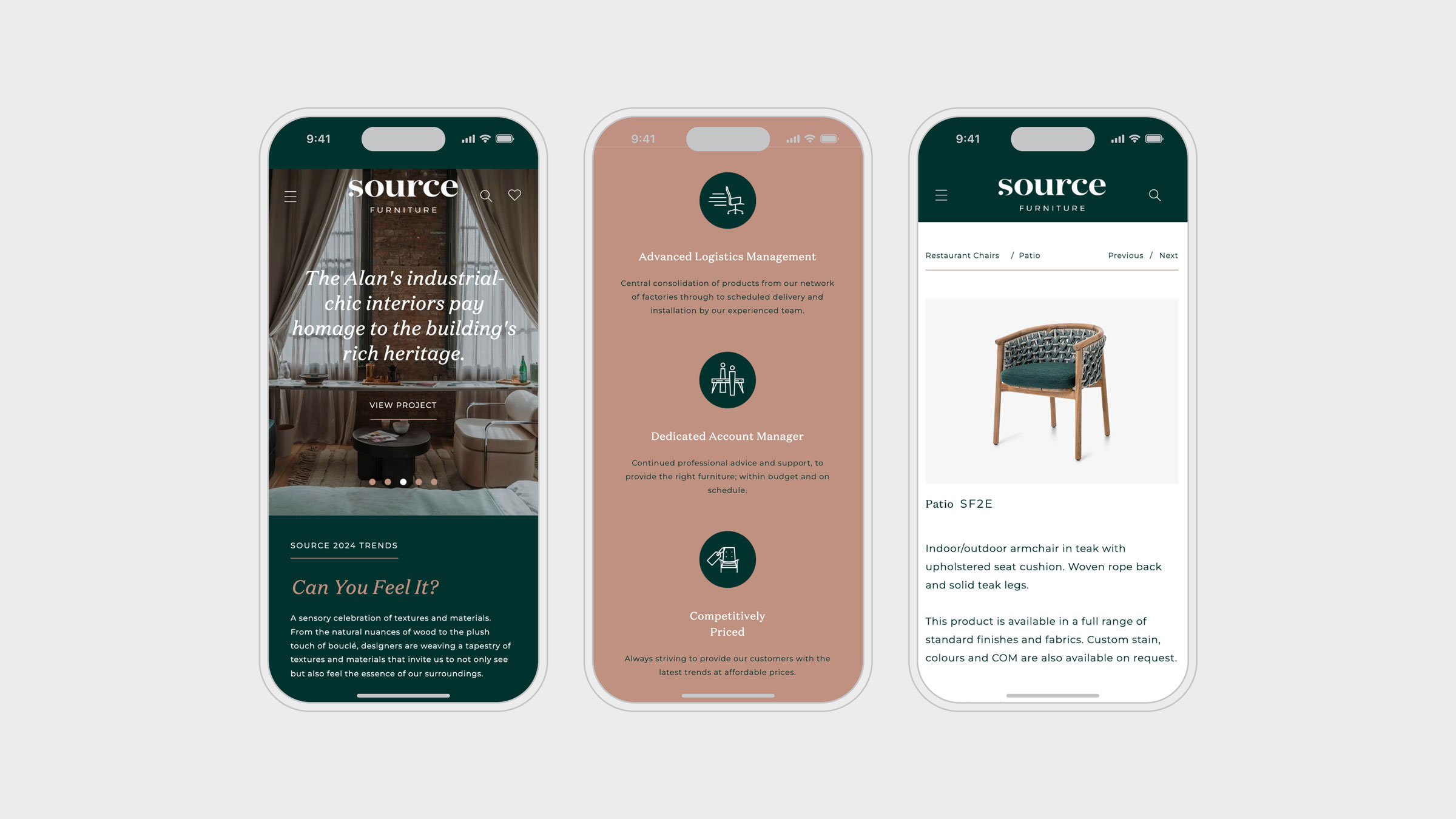
Through research into leading retailers, competitor brands and designer workflows, we developed a new site architecture that unites products, bespoke projects and trend content in one coherent, navigable system. The goal was to create a platform that balanced editorial style with practical substance.
The site is designed to work the way design professionals do. Visitors can browse by type, style or trend, narrowing their search with precise filters for material, finish, size or price. Products can be saved into personalised project lists, allowing designers to curate, refine and retrieve their selections quickly — streamlining the sourcing process from inspiration to order.
The visual language is rooted in current interiors trends, with a palette of terracotta, green, light grey, white and black. Typography combines the elegance of Domaine Display with the modern clarity of Montserrat, reflecting Source’s dual role as curator and supplier. Photography is treated with restraint: neutral backgrounds, generous white space, and a balance of product close-ups and styled shots give the site an editorial polish while keeping focus on the furniture itself.
We identified key trend stories such as The New Arts & Crafts and Retro Mashup, woven directly into the product ranges to create a seamless link between inspiration and specification. This integration allows visitors to explore the creative thinking behind each look while instantly accessing the products that bring it to life.
The redesigned website positions Source as a go-to resource for the design industry. It delivers an editorial, high-end feel without compromising on speed or usability. Designers can browse, shortlist and specify products with ease — all while engaging with a curated stream of interiors inspiration. A platform that works as hard for sourcing as it does for storytelling.