Why emotional wellbeing is becoming the new brief for interiors.
We no longer design spaces just to be beautiful. We design them to hold us, soften us, steady us. Emotional wellbeing has moved from the fringes of wellness culture into the core brief for the living sector – and it’s reshaping everything from how furniture is formed to how colour is chosen.
Homes are now more than homes; they’re places of work, rest, care, escape. They carry more emotional weight, and people are asking more of them in return. A calm space is no longer a luxury; it’s a form of support. A material choice becomes a mood. A palette becomes a pause.

We’re seeing this reflected in product development and brand thinking. Graham & Brown’s Sensory Home collection names its colours like emotions—‘Rest’, ‘Retreat’, ‘Connection’. Heath Ceramics, meanwhile, builds tactility into the everyday, designing around slowness, texture, and quiet attention to form.
Smart technology is being reframed as emotional infrastructure. Philips and Lutron are developing circadian lighting systems that adjust colour temperature to support natural rhythms; focus in the morning, calm in the evening. Wellness, once external, is becoming embedded in the room.
What used to be framed as ‘neutral’ is now emotional. What used to be minimalist is now mindful. The focus is less on visual restraint, more on spaces that restore attention, not demand it.

Designers are responding with materials that ground. Woods that soften the edges. Linen that breathes. Walls that curve. Brands like Muuto, Ferm Living and Menu are building quiet confidence into their collections – not loud innovation, but clarity. Likewise, Frama Copenhagen’s Apothecary line treats skincare as an extension of interior design – bridging scent and form in quiet conversation with the home.
There’s also a renewed attention to colour, not just trend, but tone. Earth hues, soft greens and chalky neutrals are being used to create resonance, not neutrality. Studios like Note and Norm Architects work with colour the way musicians work with silence, editing as much as they add.

This isn’t about perfection. It’s about homes that adjust with their inhabitants, not compete with them. And brands that recognise that emotional wellbeing is no longer a peripheral benefit – it’s a reason to choose.
The opportunity for companies in the living space is not just to supply products, but to support how people live and feel. To shift the conversation from “what looks good” to “what feels right”.
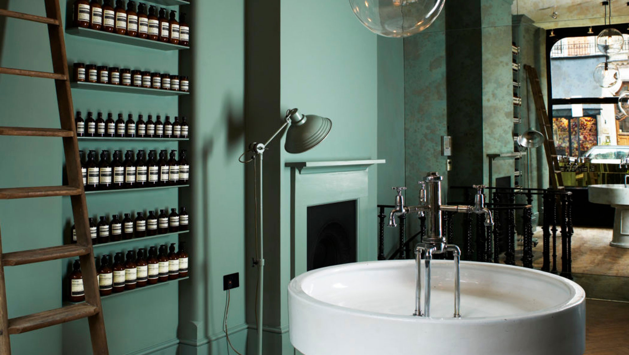
We’re seeing it in material drenching that wraps a room in one calming texture; from the deep green, tone-on-tone interiors of Ilse Crawford’s Aesop Mayfair store to the warm timber panelling of hotels designed to blur the line between home and hospitality. In biophilic elements that bring the rhythm of nature indoors. In furniture that embraces multi-use living; sofas that become beds, tables that transition between work and dining – without losing their sense of ease.
Emotional wellbeing isn’t a style – it’s a reminder that the spaces we create shape how we feel, not just how we live.
Why The Matters
More from
Lifestyle
: Insight, Creative & Strategy